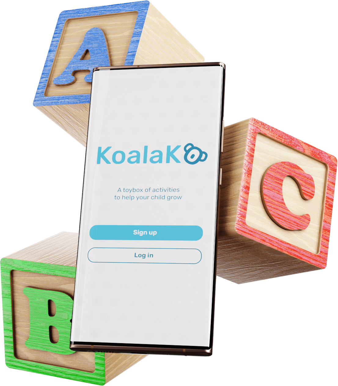
KoalaKo
Supporting Parents in Fostering
Creative Development
DESCRIPTION
Creative development thrives when kids can experience a range of mediums for self-expression. We provide parents with a curated feed of unique activities and locations for play.
DELIVERABLES
- Interactive prototype
- Video presentation & pitch
TIMELINE
9 Weeks
TOOLS
THE TEAM
Me
Project Lead
UX/UI Design
Research
Jianing Li
UX/UI Design
Research
Marko Prodanovic
UX/UI Design
Research
Zhiyi Liu
UX/UI Design
Research
BACKGROUND
“Creativity is in crisis” - LEGO & AKQA
Design agency AKQA hosts an annual competition called ‘Future Lions.’ Partnering with LEGO in 2021, their challenge targeted the growing problem of play being seen as a ‘nice to have,’ rather than a critical part of a child’s development.
BACKGROUND
Create a digital-age solution that reinforces
the importance of creativity, and play
No open social platforms
Child-focused social media raises many security concerns.
As well, children already spend countless hours a day on existing platforms.
Bring play back into the real world
Emphasize physical, explorative play
OPPORTUNITY
How might we encourage explorative play
while following these considerations?
SOLUTION
KoalaKo, the smart activity database
built to help parents help kids

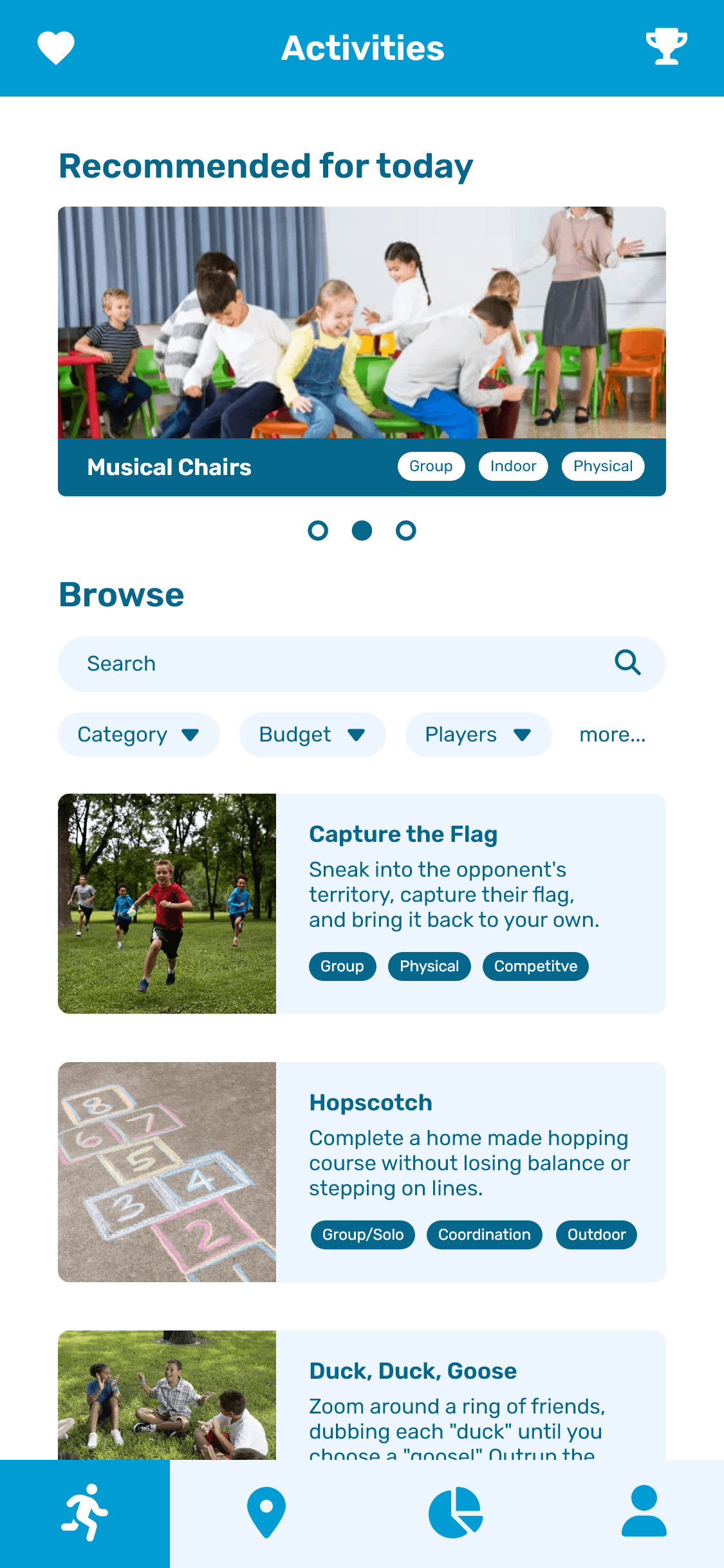
Entertaining kids can be a challenge. To help keep play easy and fun, KoalaKo provides parents with a toolbelt of games and locations to explore.
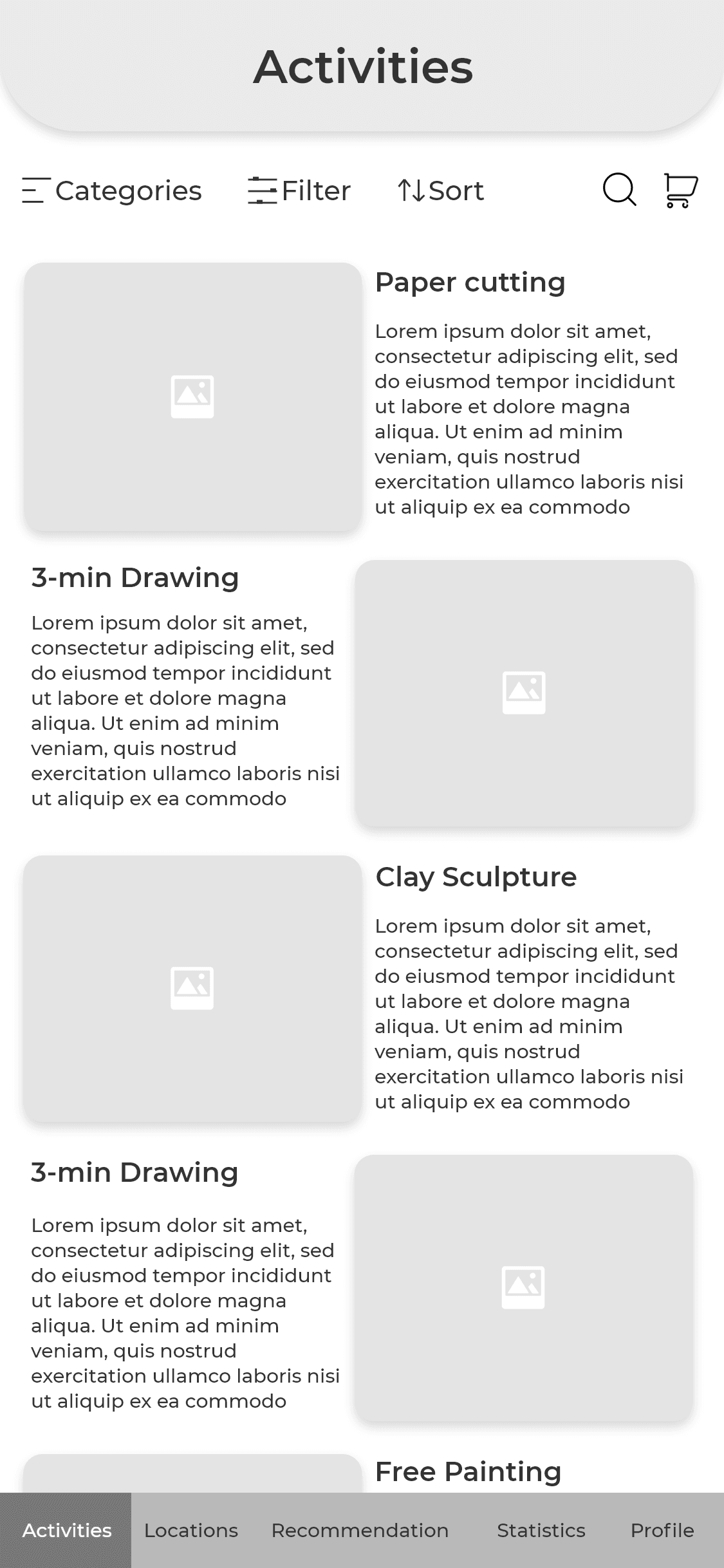
Variety is a strong focus, as it encourages creative development. Activities range from social to solo, mental to physical, and lots more.
Find activities
that inspire exploration
Get activity suggestions relevant to your child’s interests, to help grow their passions and hobbies.
As well as activities that push your child’s creativity into new territory.


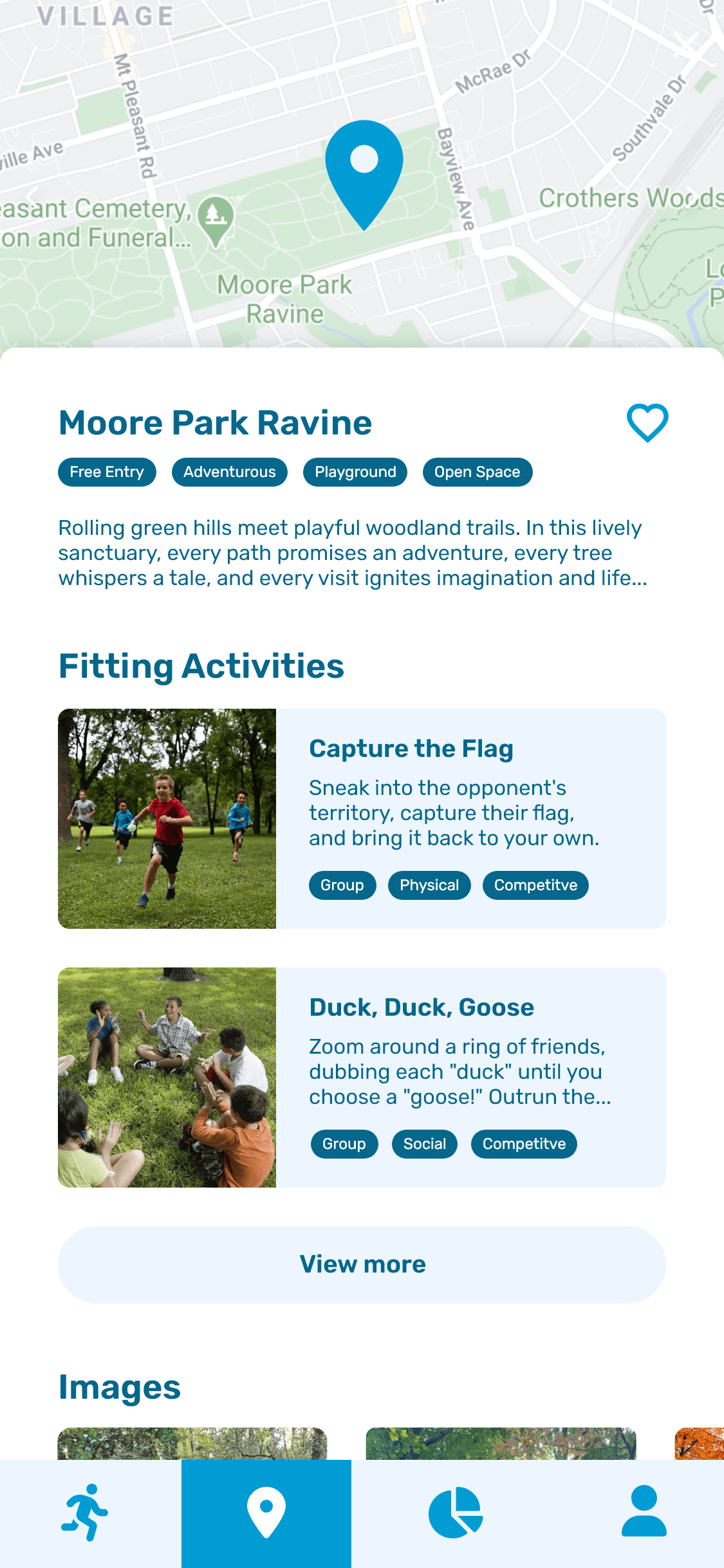
Search local spots for worldly creativity
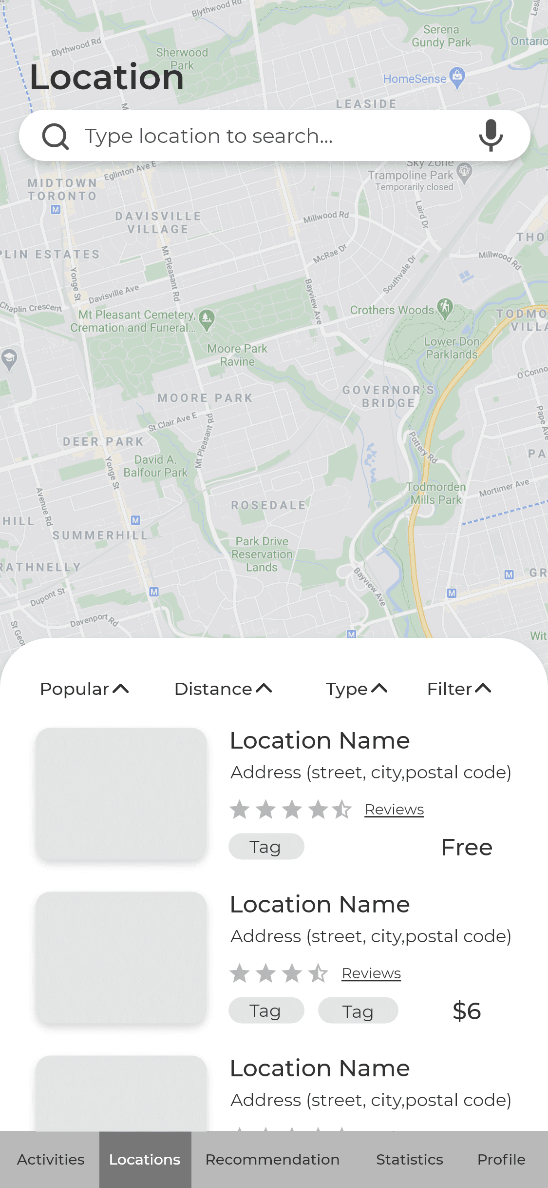
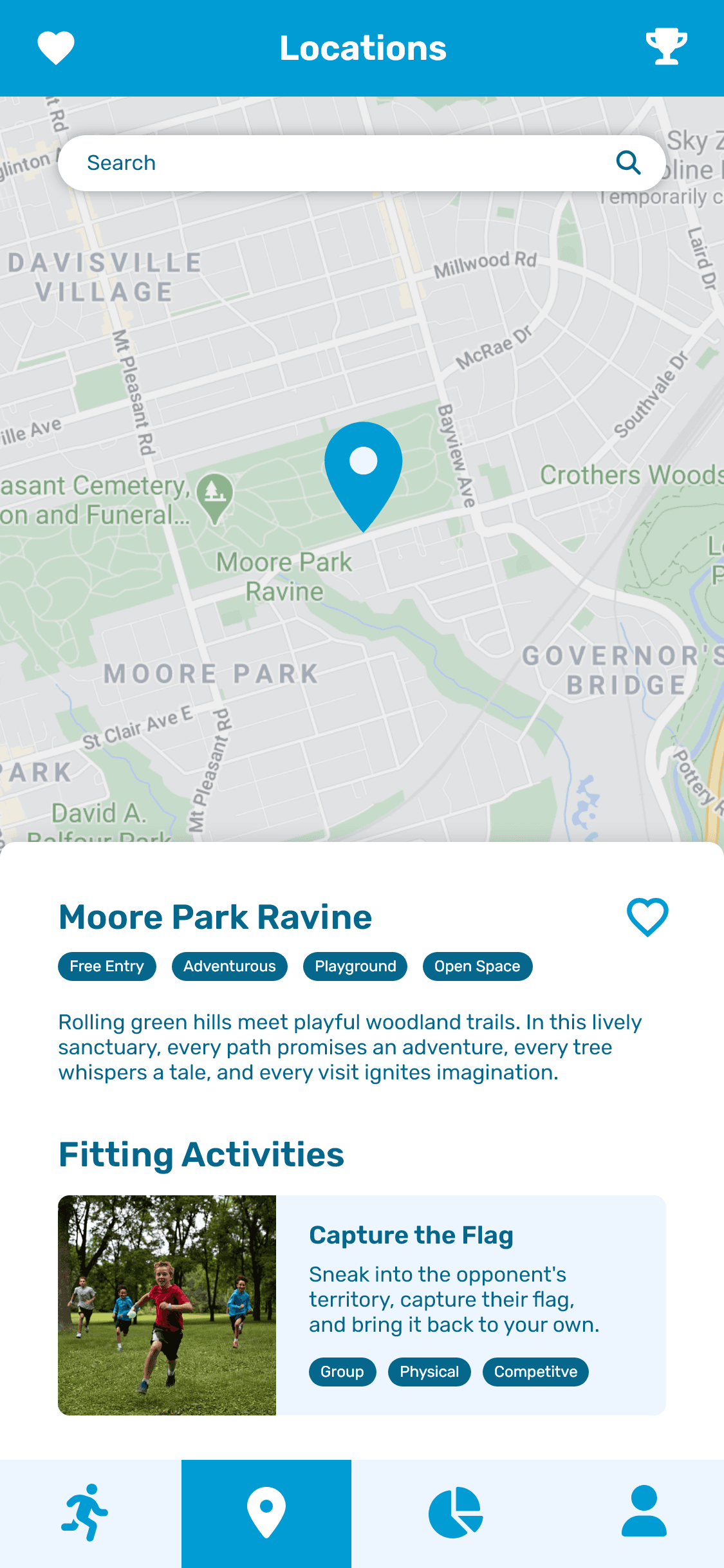
Find a space that perfectly matches your activity, or activities that match your space!
Filters allow anyone to adventure outside the living room. These include distance from home, and entry fee versus free.
No personal information
required from the child
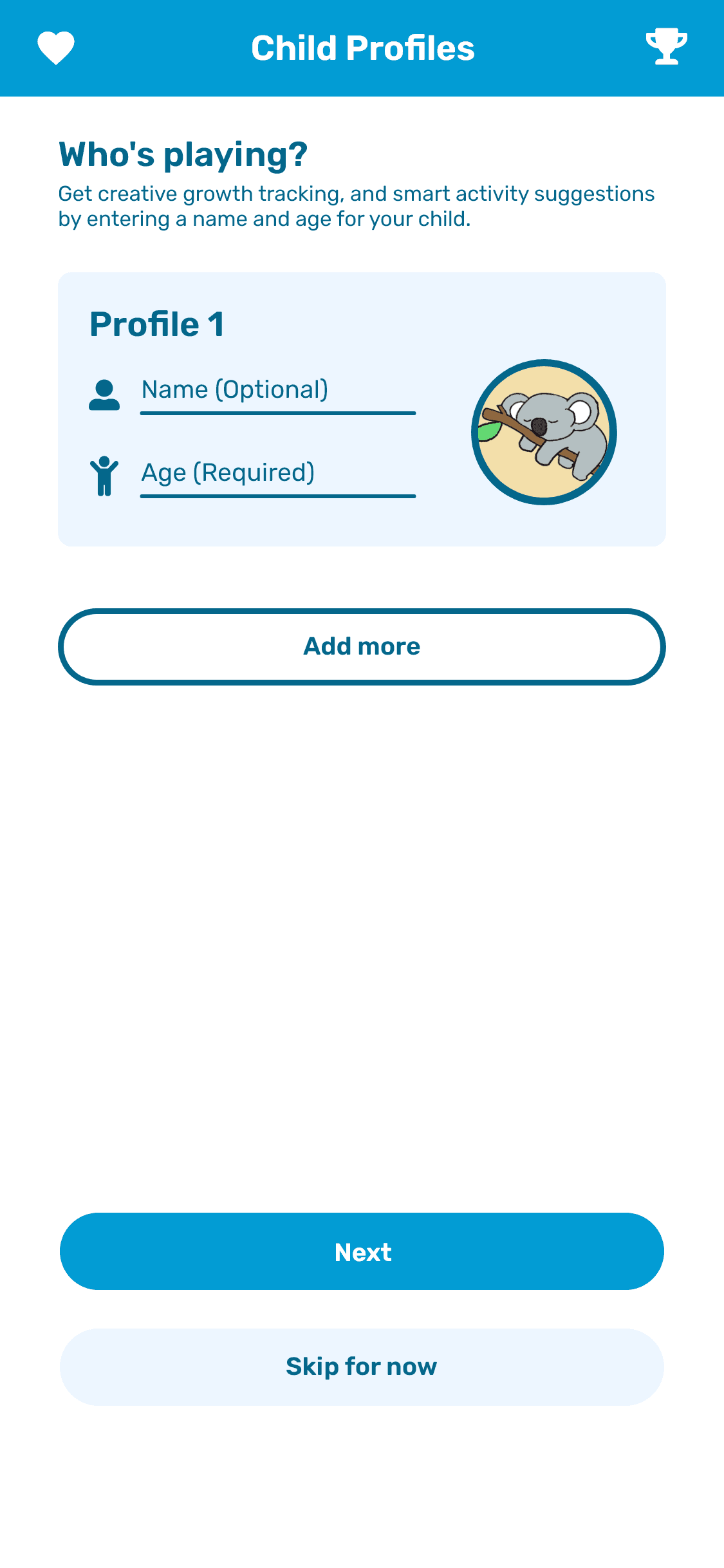
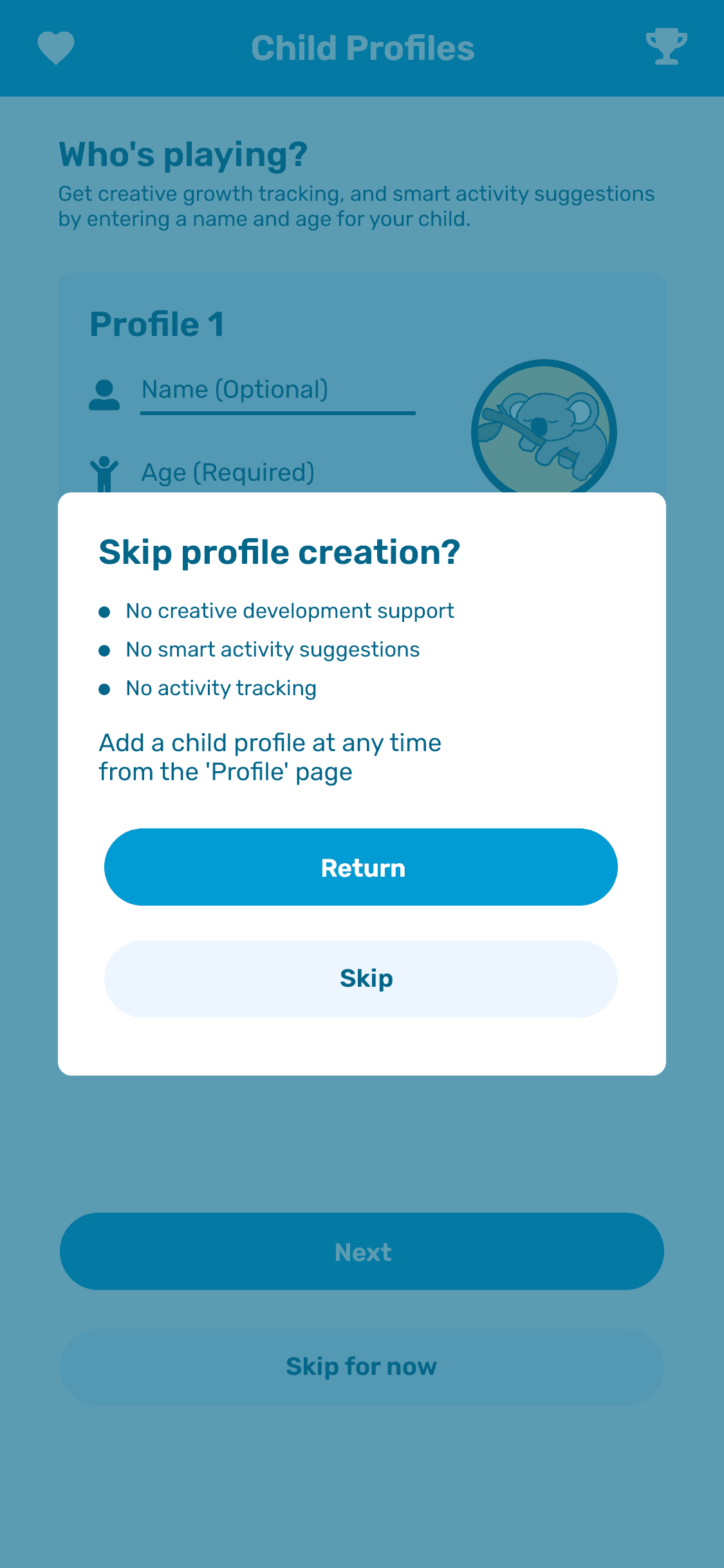
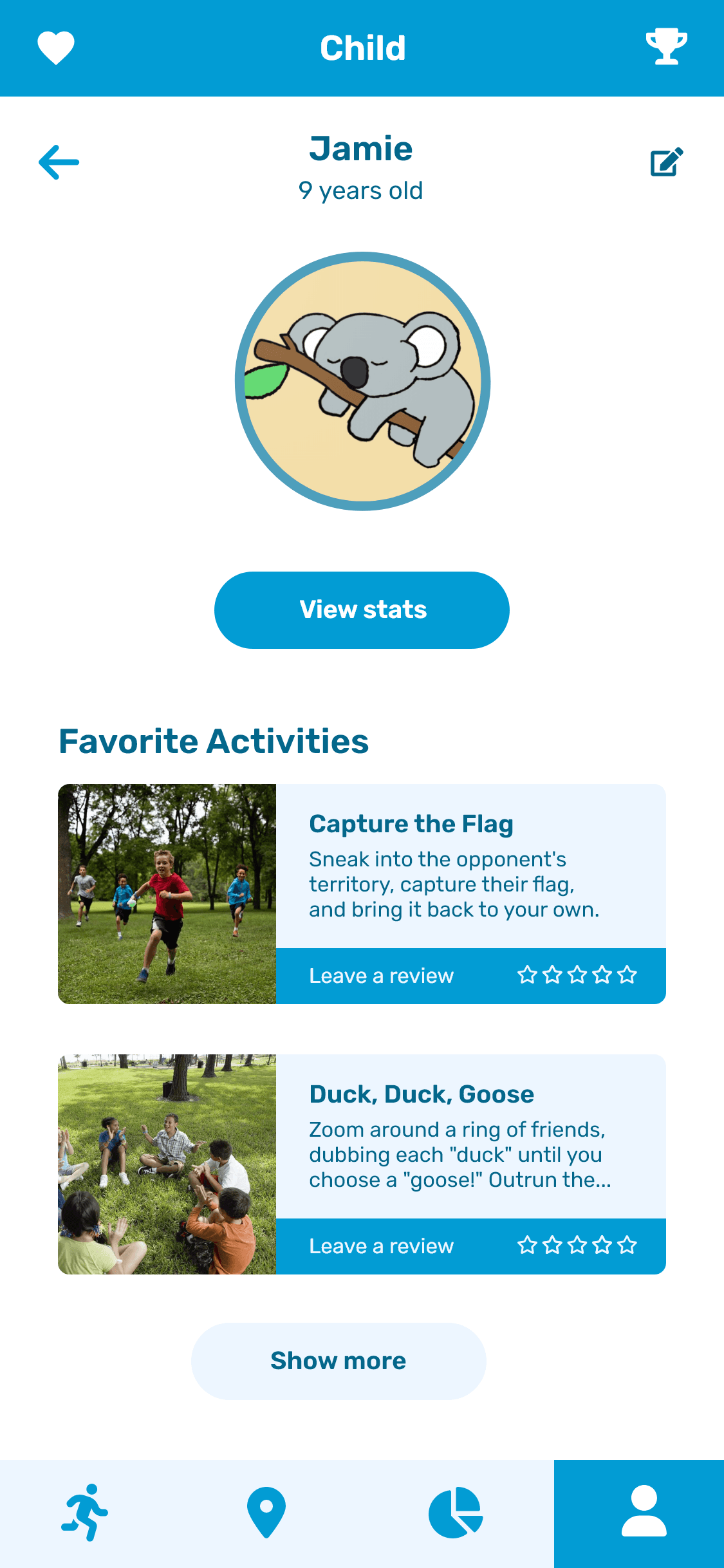
If parents provide a child’s name and age, they enable smart activity suggestions. These keep games age-appropriate, and varied, based on past experiences.
If they opt out, the app still functions as a treasure trove of activities. Searchable and browseable, just not as ‘smart.’

Building KoalaKo
PROJECT PLAN
Plotting timeline, and team expectations
Our plan ensured enough time to research our topic before ideation. From there, we would distill the promising concepts.
Next, we’d test and get feedback with a prototype. Rinse and repeat to address feedback, and refine our solution.
SECONDARY RESEARCH
Research into creative development
revealed the importance of play-style breadth
With these findings, we began searching for solutions
to encourage explorative play
BRAINSTORMING
Finding ideas
Rapid-fire idea creation, narrowed down to a promising concept.
CRAZY 8S
Exploring medium
Comic-style sketches of a user’s journey to help us find our medium. Is it a location? An app? How does a user receive the intended value?
IMPORTANCE VS. DIFFICULTY MATRIX
Removing fluff
We plotted our ideas on a chart of value to the user vs. difficulty to implement. We then cut ideas that didn’t directly support parents in fostering creativity.
EXPERIENCE ROADMAP
Solidifying scope
From MVP to polished service, we defined 3 project tiers: cupcake, cake, and wedding cake. We picked the level that fit our requirements, and goals.
LOW-FI PROTOTYPES
Low-fi prototypes for user testing
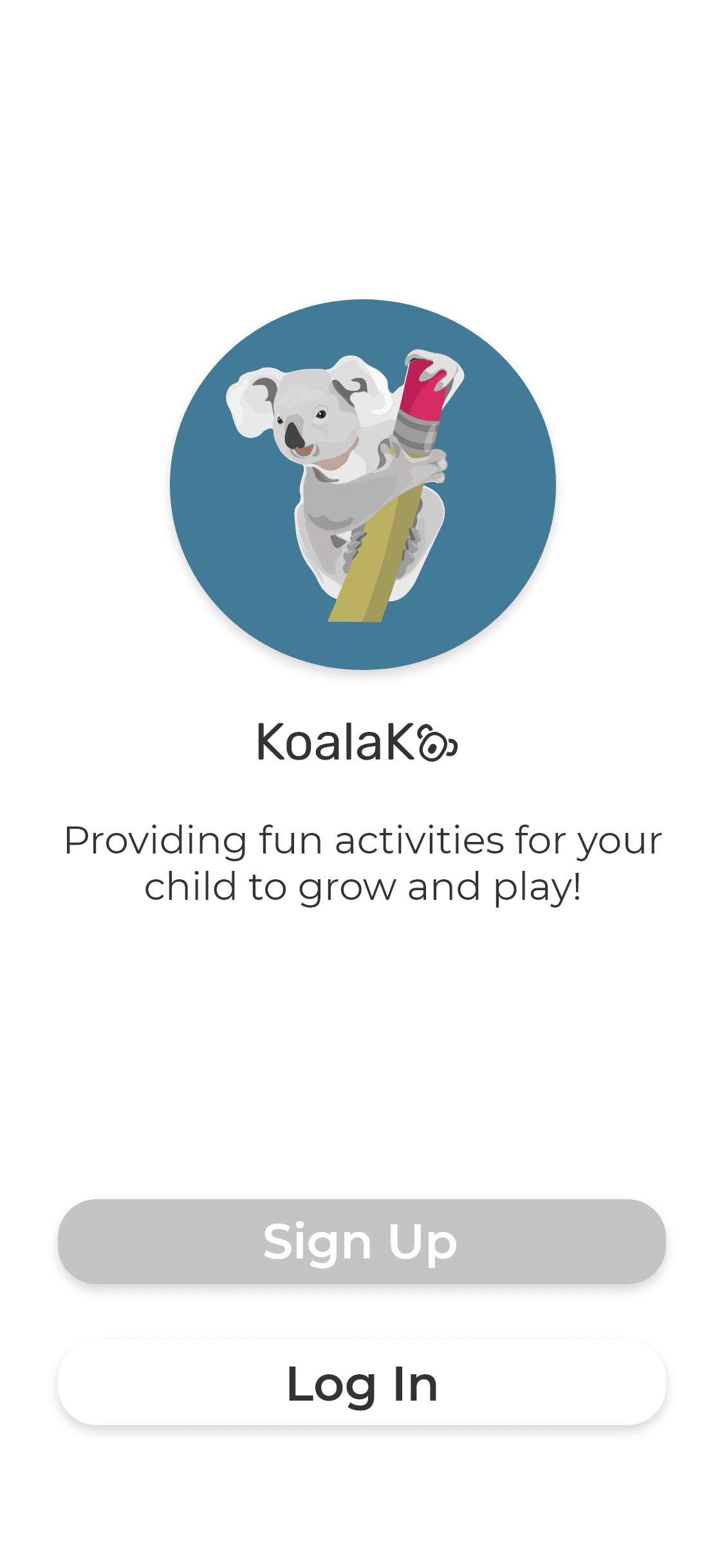
Onboarding
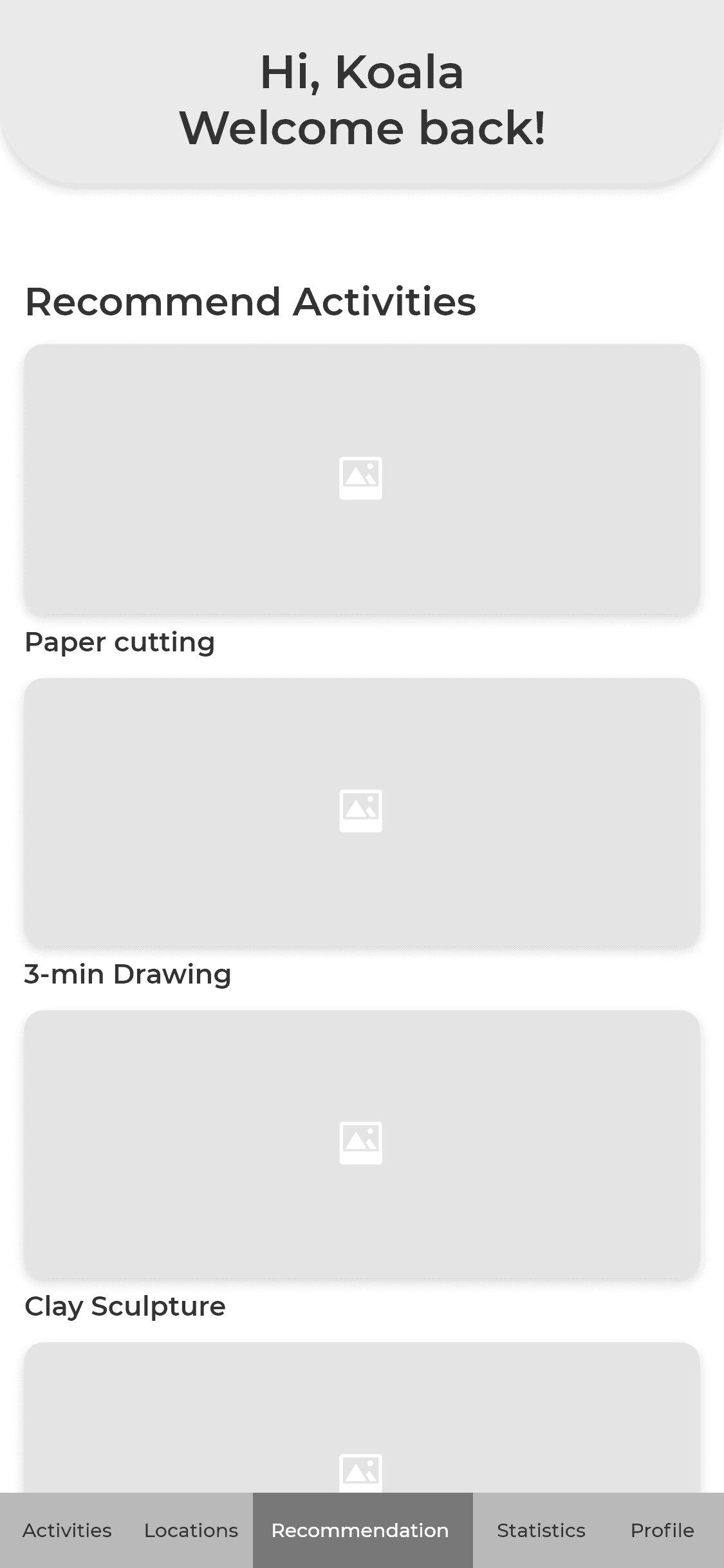
Homepage
Activities
Location Browse
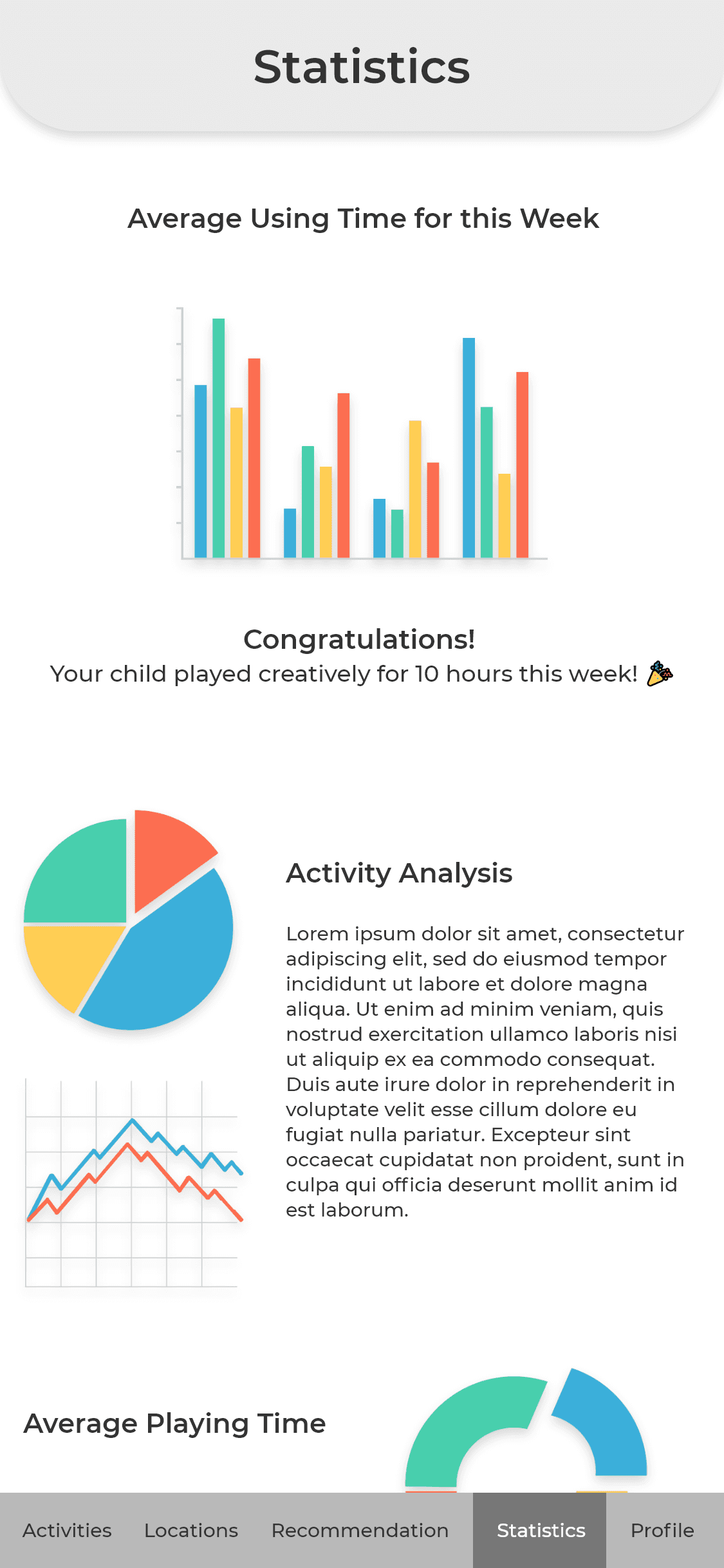
Statistics
Here we chose the name ‘KoalaKo.’ It’s playful and curious, like the koala joey it accompanies.
Our platform would be mobile-first, prioritizing quick access from wherever play might occur.
TESTING
Valuable feedback despite obstacles
in our user sample
Finding available parents, or navigating the ethics of testing with children, proved difficult within our timeline.
We instead tested with 4 young adults, some of whom helped raise much younger siblings.
METHODOLOGY
Freeform comments,
and prepared questions
Immediate impressions and pain points, then digging deeper into thoughts / feelings.
FINDINGS / SUGGESTIONS
Finalize the user, do kids use the app? Or just parents?
Activity recs should take a child’s interests into account
The location feature should work in two directions: ability to browse locations that match a desired activity, and activities that match a desired location.
IMPLEMENTATION PLAN
Noting suggestions, and refocusing our goals
We finalized our decision to make the service parent-centered. This allowed us to cut features planned for child use, and avoid the pitfall of creating yet another reason for kids to use screens.
The suggested location feature became a main focal point. Lastly, we decided it was imperative to gather parent feedback in the next phase, to better understand our demographic.
HI-FI PROTOTYPES
KoalaKo’s first hi-fi interactive prototype
Userflow Map

Onboarding
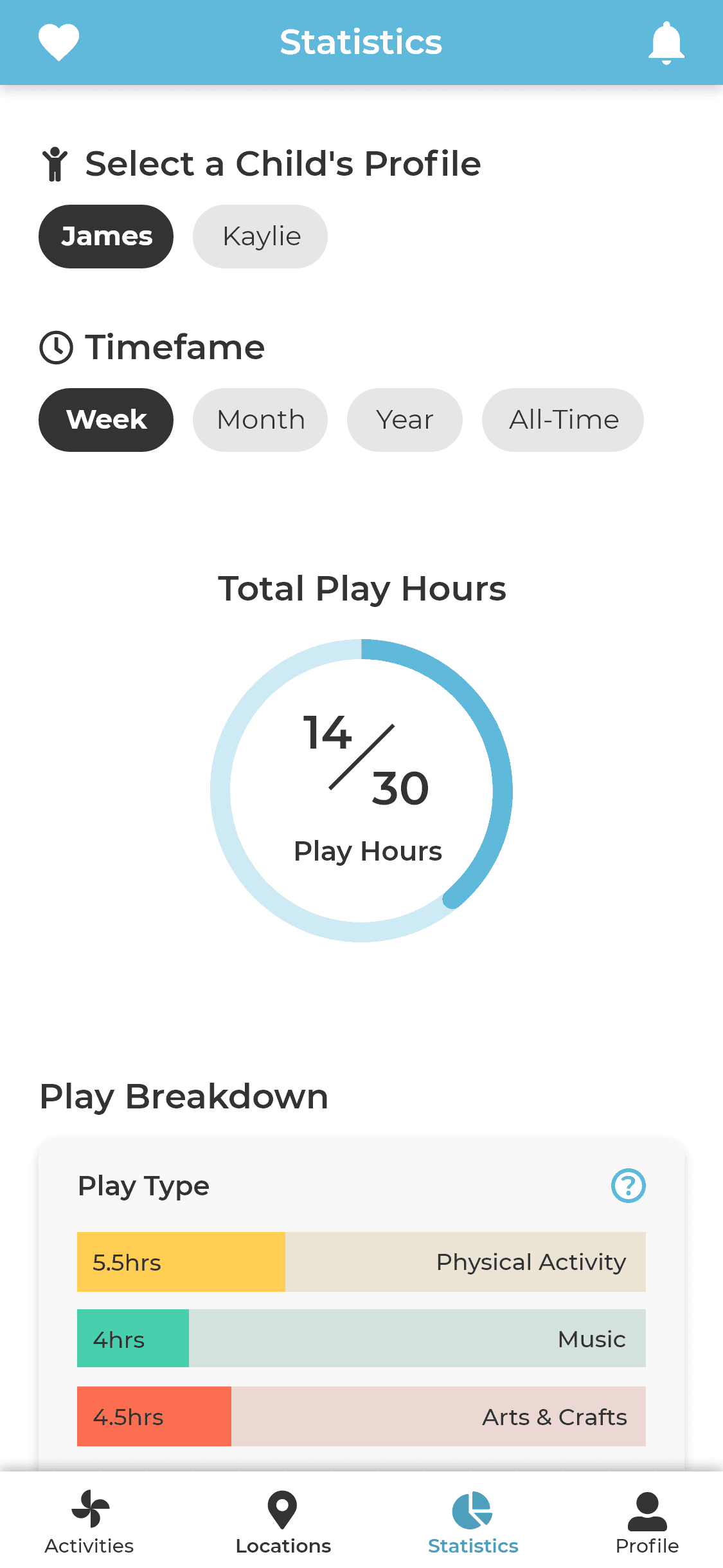
Play Statistics
Features added at this stage include:
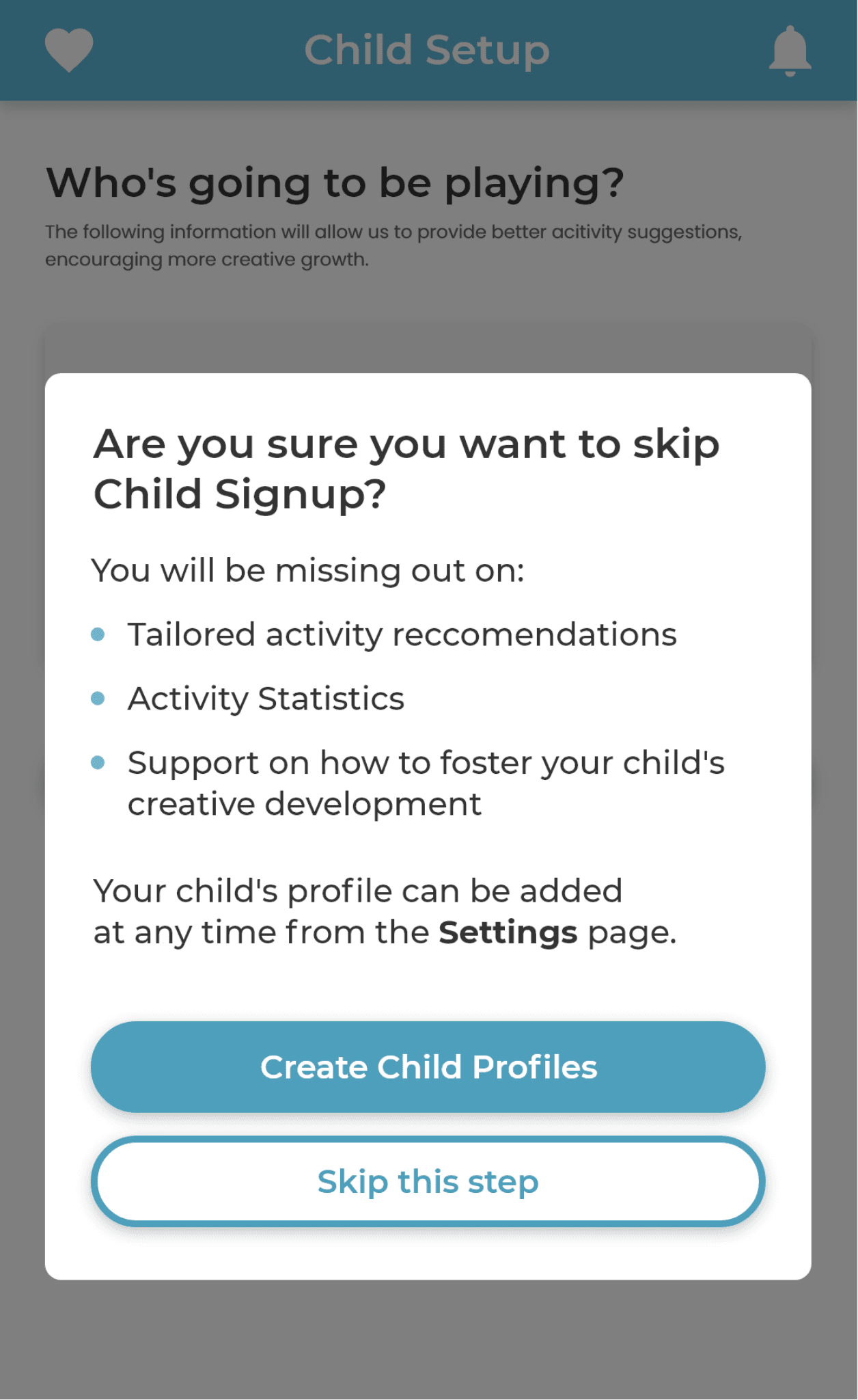
Optional child profiles
Parents can decline sharing their child’s age or name, disabling the smart features, but keeping activity browsing accessible to all users.
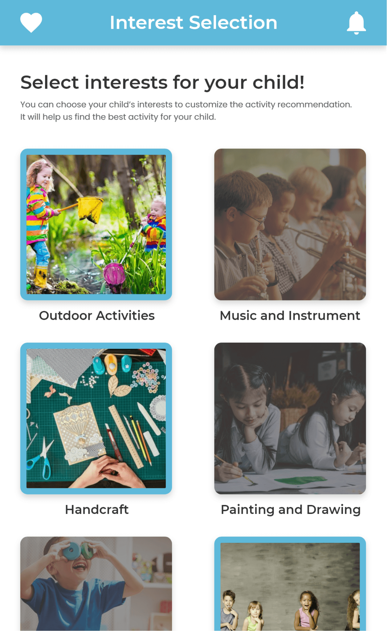
Selecting interests
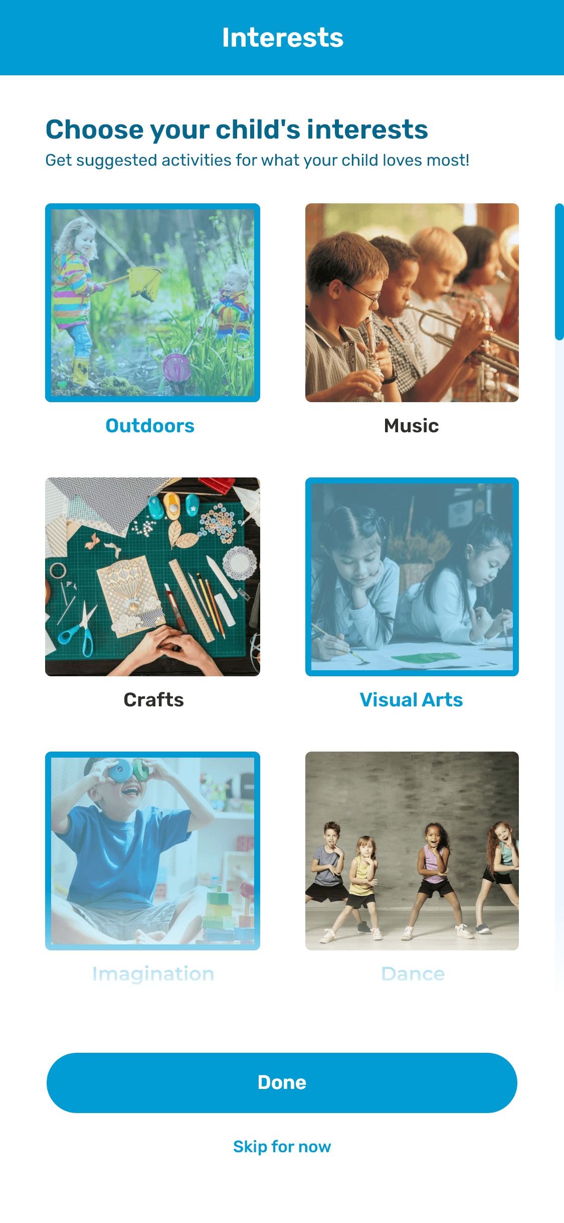
Choosing a child’s interests at sign-up allows us to better support their passions through suggested activities.
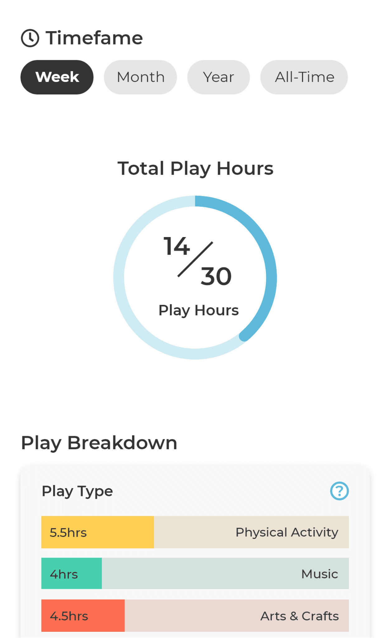
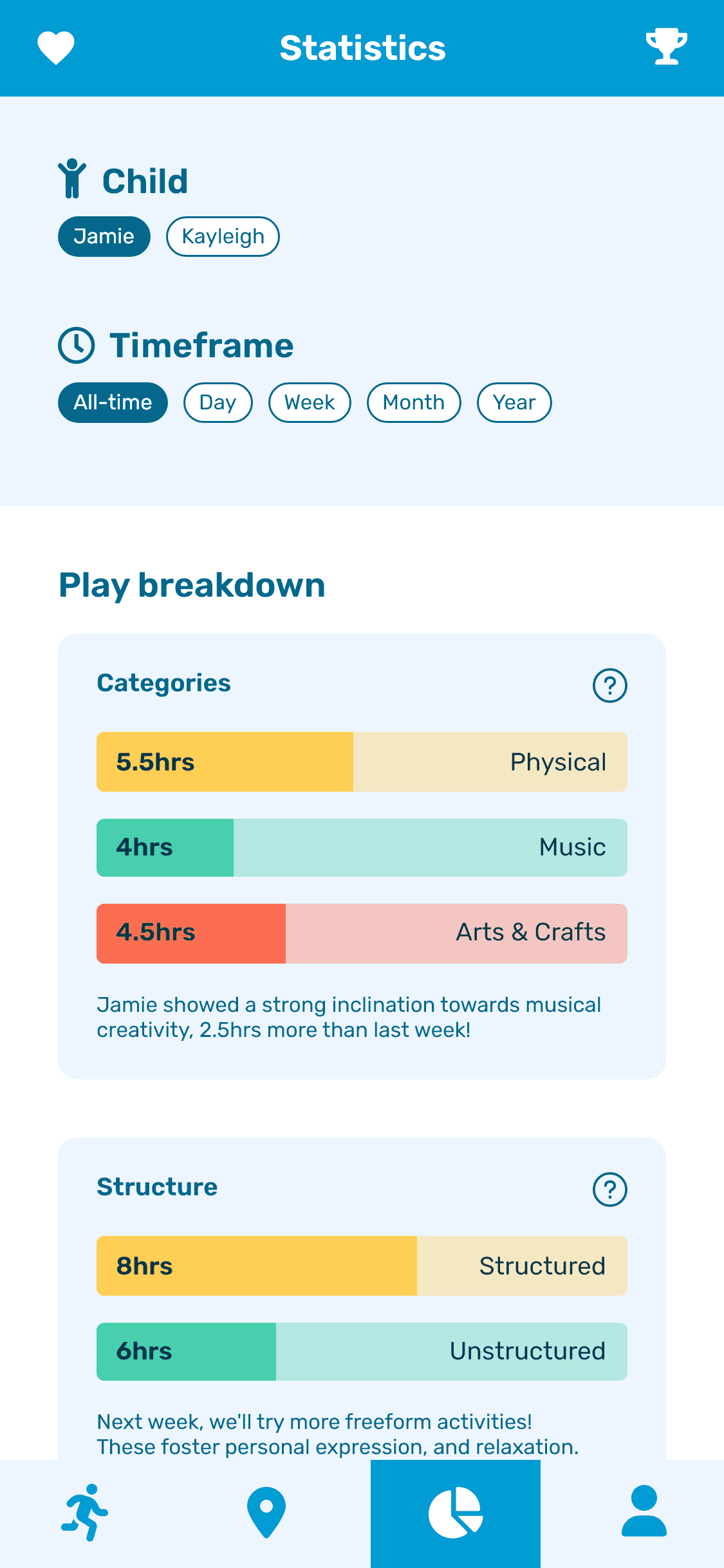
Refined statistics page
Explore play history, and find which experiences your child is yet to try. Goal-setting helps to encourage regular playtime.
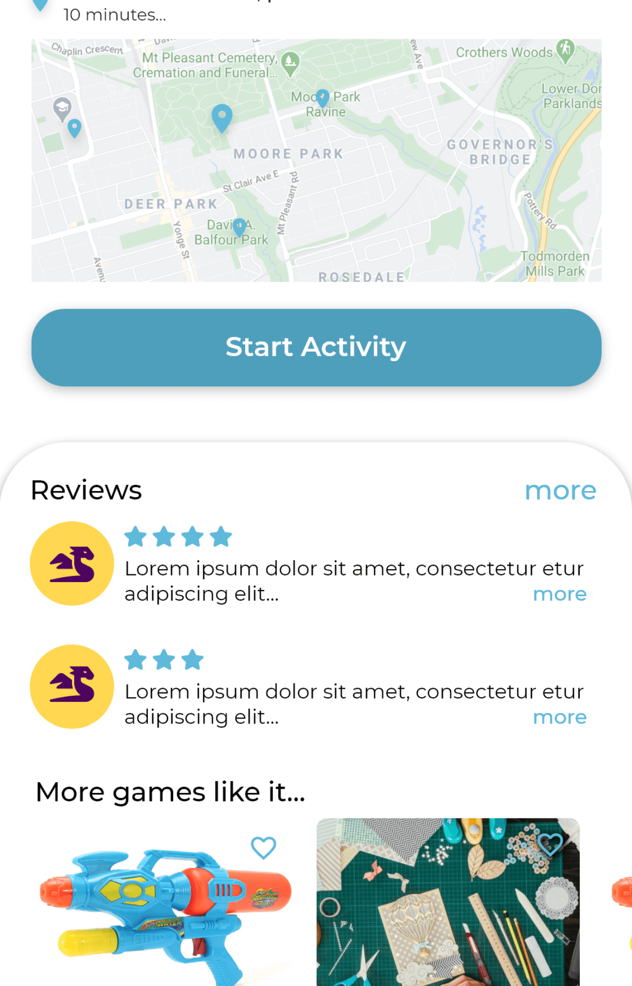
Community feedback
Activity and location rating for better recs, and to bring poor suggestions to the platform’s attention.
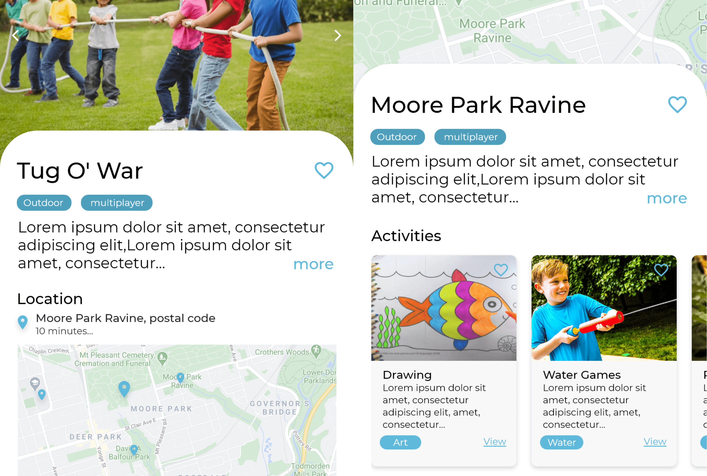
Location browsing
Users can now browse locations that match activities, and activities that match locations, as suggested by our testers.
TESTING 2
Round 2. TEST.
We were able to include 1 parent in our group of 4 testers. Scheduling and timeline made it difficult to find more, despite our best efforts. However, their feedback was invaluable.
METHODOLOGY
User testing involved:
Usability Tasks
Find the pain points throughout the core pages and features.
Popcorn feedback
Free-form, unstructured comments were encouraged during the test.
Pre-written questions
Questions for each tester helped us find more specific information.
FINDINGS
Discovering a need to reframe, and add features
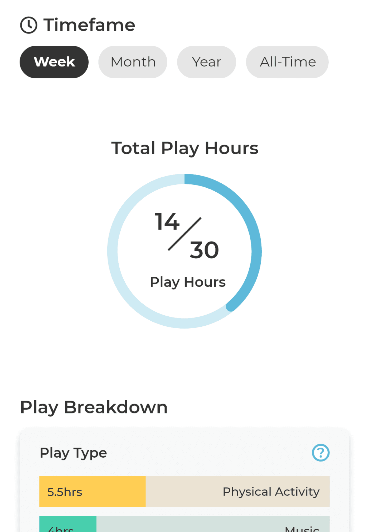
The ‘goal setting’ feature makes me feel pressured, like if I fail to reach a goal then I haven’t done enough for my child.
- User #1 (Parent)
Achievements may help the activities feel more optional, and less like you must do them to support your child.
- User #3
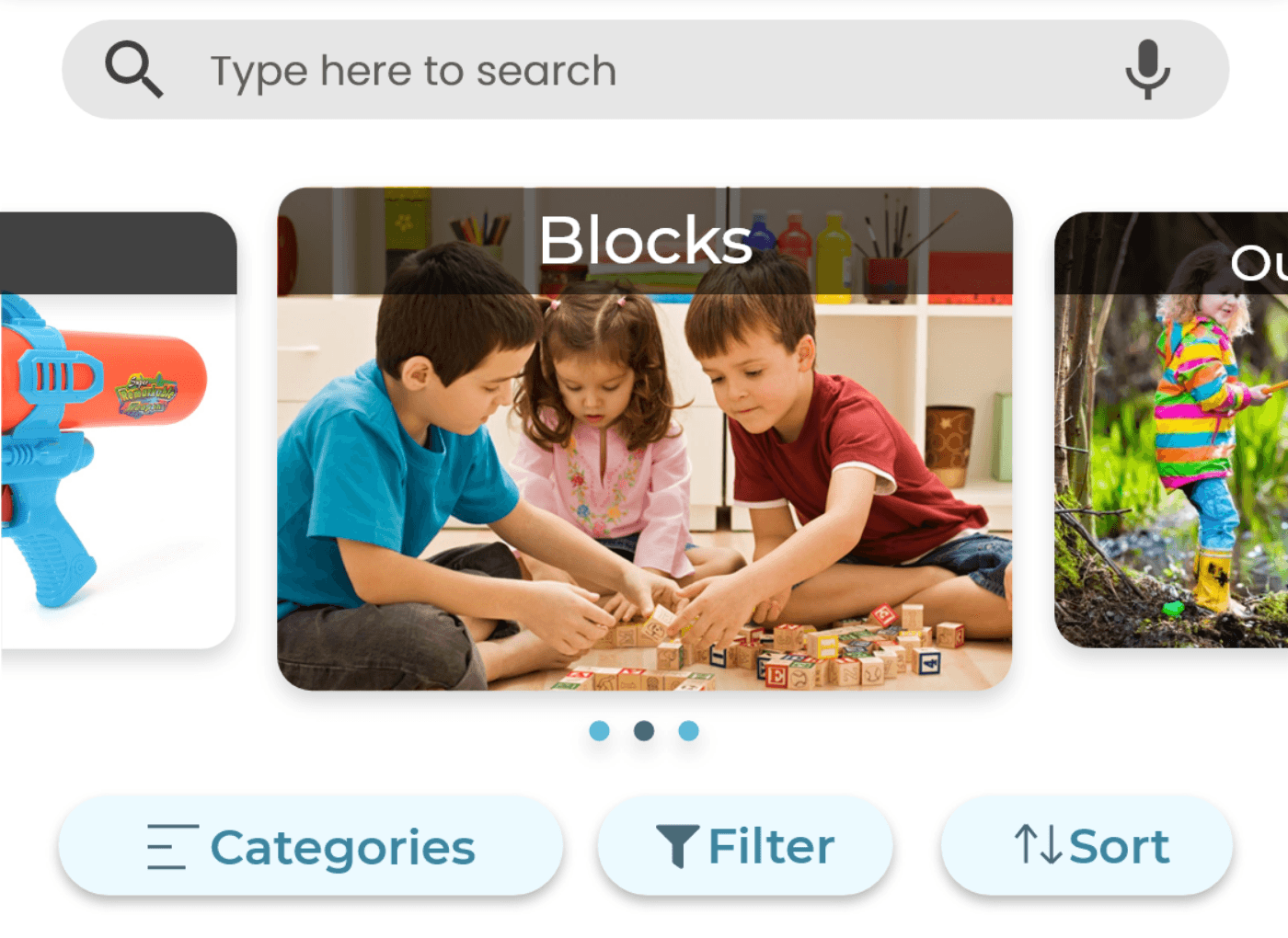
It would be great to see a filter for solo, one-on-one, or group activities, or budget.
- User #2
HI-FI PROTOTYPE 2
Honoring the efforts of parents, rather than setting expectations
Testing revealed a didactic tone. Features like play time goals were telling parents what to do, rather than being encouraging.
We aimed to bring their efforts back into the spotlight during this next round of improvements and tweaks.
Removing play time goal-setting
Visualizing play as a meter that needs to be filled was creating a sense of pressure during user testing.
Without this feature, we were no longer enforcing requirements on parents, simply providing a place to watch your child grow.
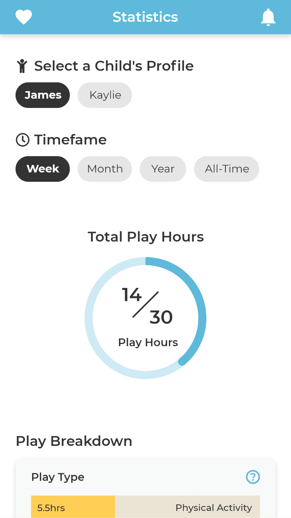
BEFORE
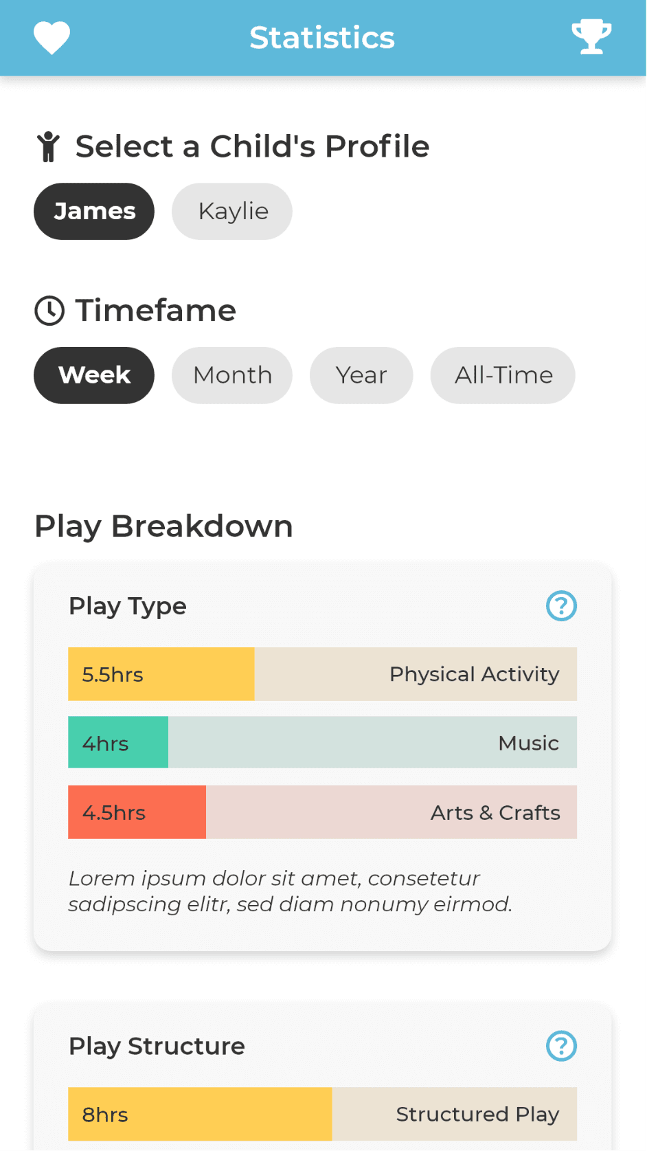
AFTER
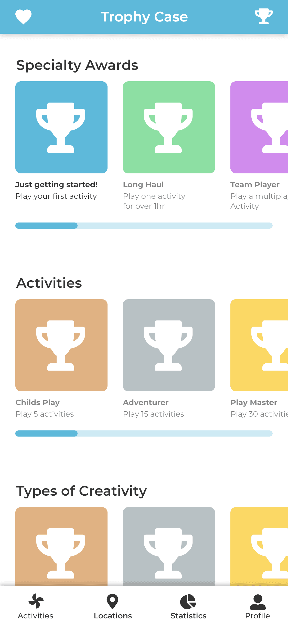
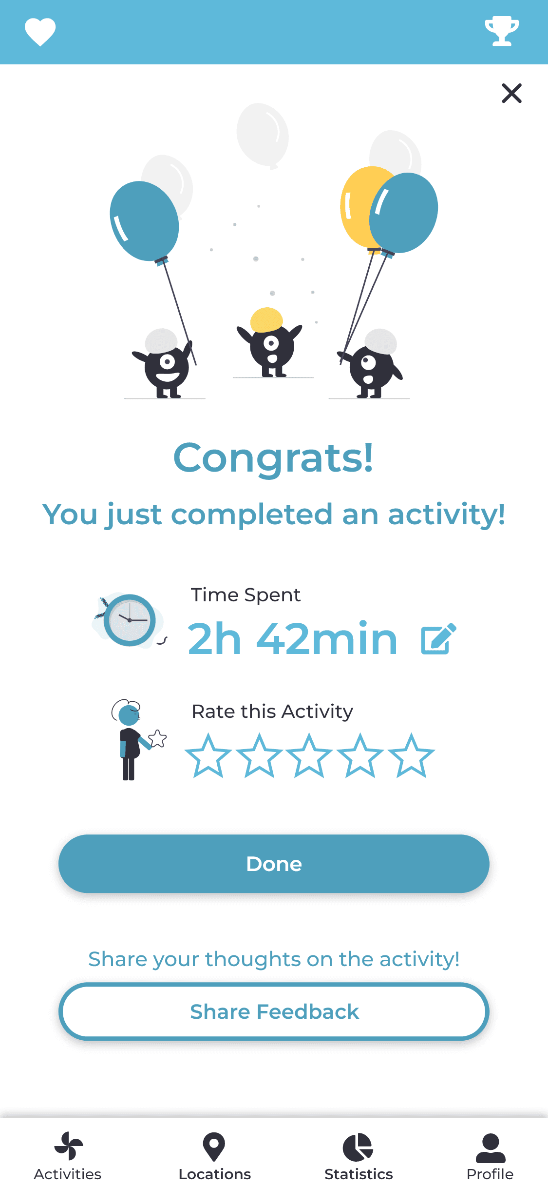
Improving positive feedback
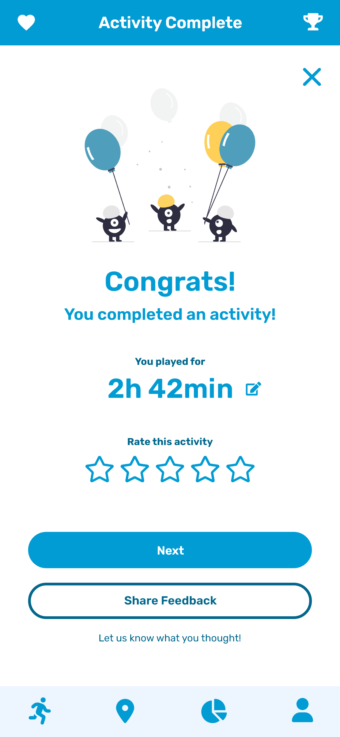
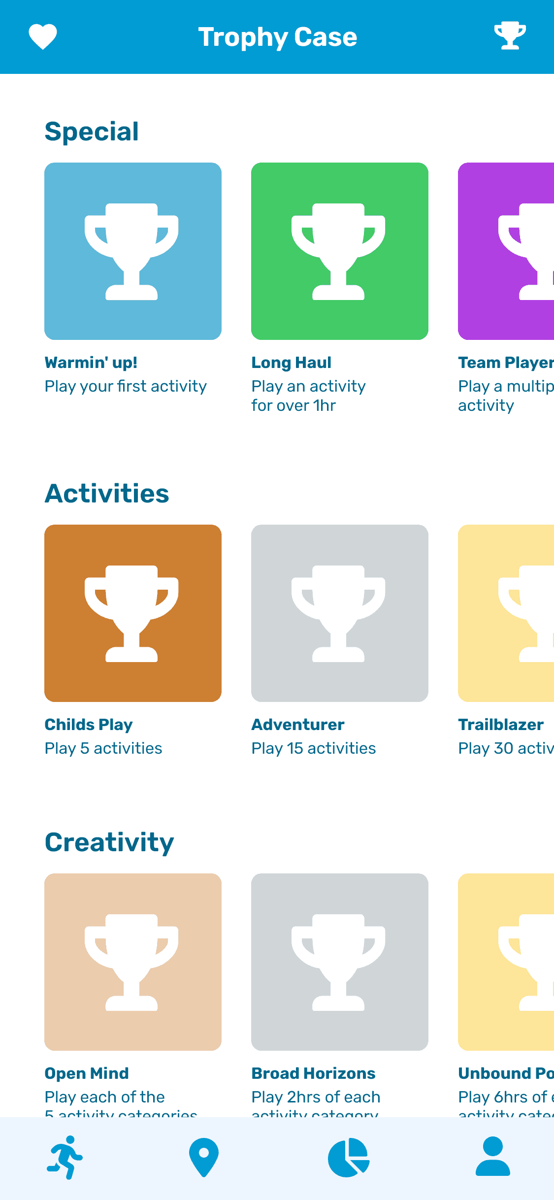
Trophies honor the achievements of both the children and the parents, furthering the supportive tone and messaging.
As well, a redesigned post-activity screen celebrates the time they chose to spend having fun with their child.
HI-FI PROTOTYPE 3
Revisiting the project with a visual refresh
In making this case study I decided to overhaul the UI design. This was an earlier project of mine, and its age began to show.
The screens lacked cohesion. As well, I felt the value in the service’s concept didn’t quite shine through in execution.
Visual overhaul
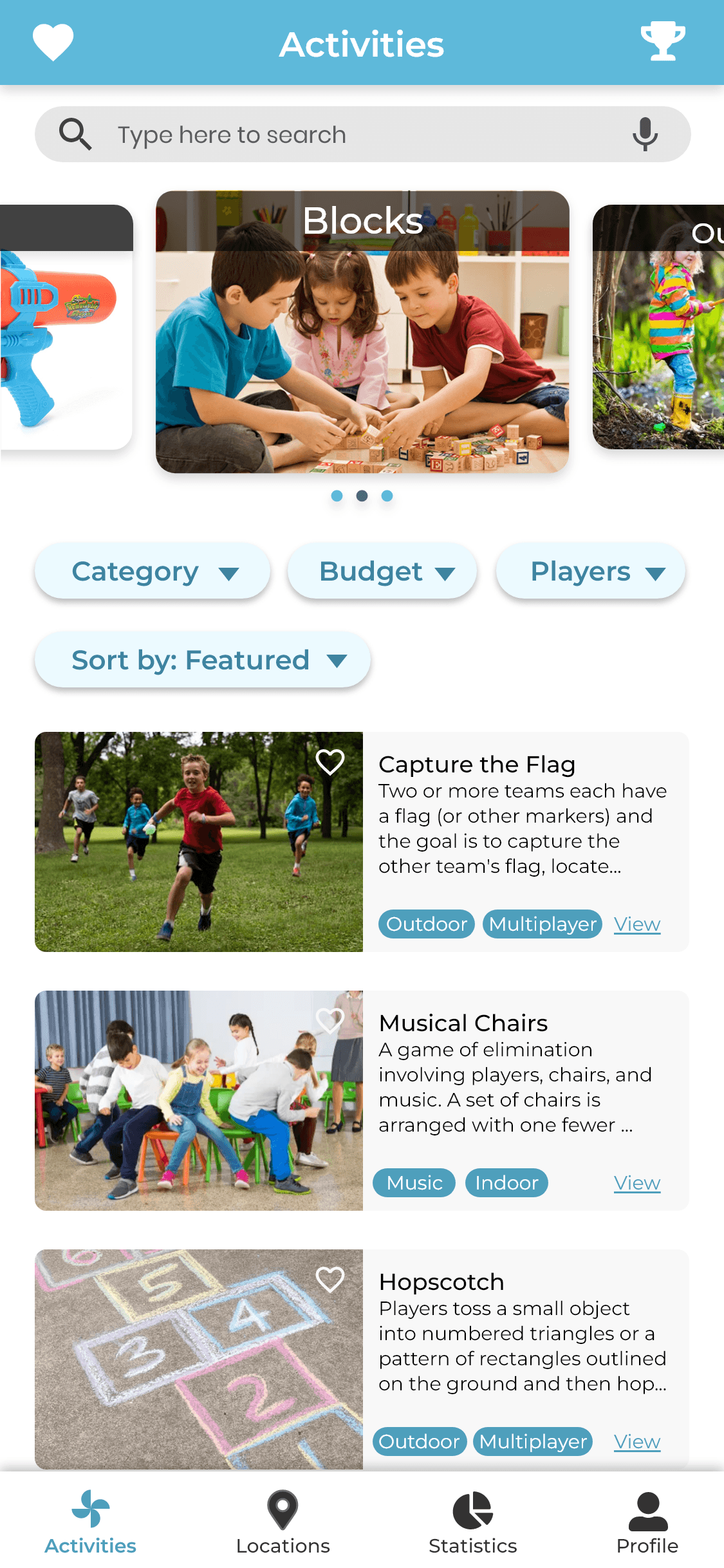
The original screens lacked whitespace, and had too many elements with differing design styles. Usability suffered with all the cluttered elements and text on screen.
Typesetting, and breathing room were a strong focus. Above all, I aimed to make the service more approachable.
BEFORE

AFTER
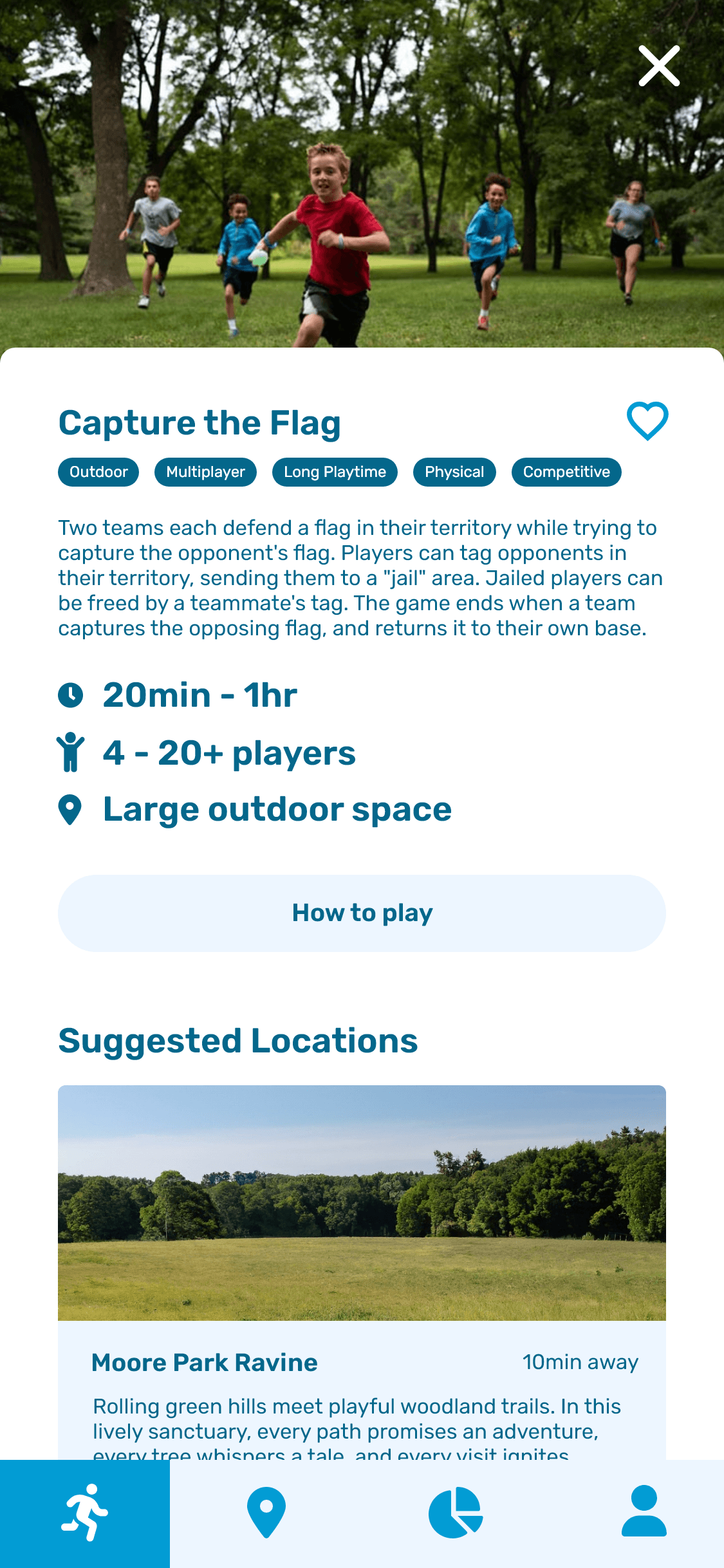
Fleshing-out features
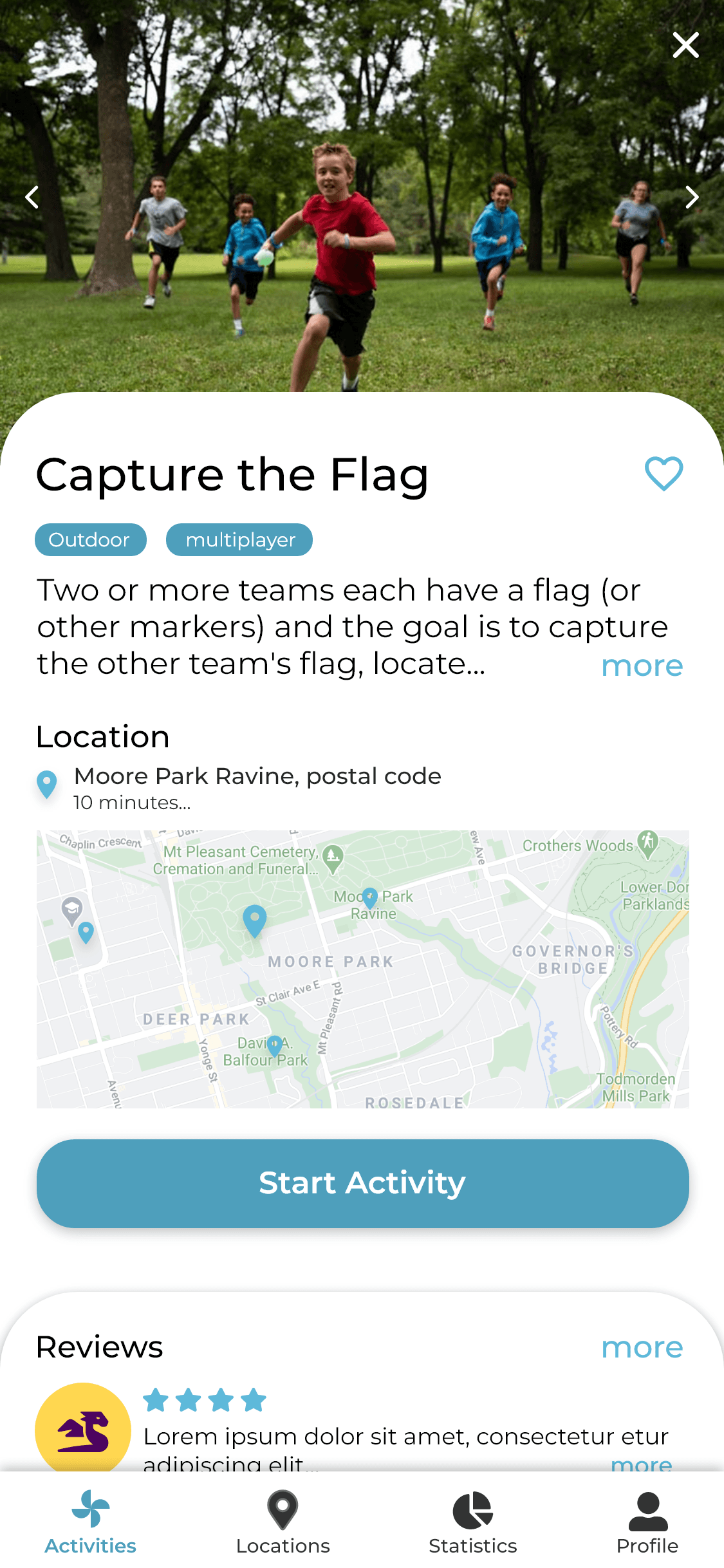
There was some noticeably underdeveloped functionality. Activity listings, for example, were missing crucial info.
In the redesign, parents can see player count, and game length, at a glance. They also have a clear call to action to view the ‘how-to’ details, like set-up, rules, and supplies.
BEFORE
AFTER

Final Submission
SUBMISSION
Helping parents
help kids grow
KoalaKo is a smart, accessible tool for parents who need a helping hand with keeping their kids engaged, and creative.
Built for the needs of any parent, and the interests of any child.

SUBMISSION
A digital-age solution
to the crisis in creativity
Our platform answers LEGO and AKQA’s call to bring creativity back to center stage by supporting parents in keeping playtime unique and exciting.


AREAS OF GROWTH
Addressing security concerns,
and improving the first impression
During testing, some users voiced concerns about personal information being saved in the app. Which, later tests proved we had solved by making child profile setup optional. These concerns could be further addressed by making the initial account setup optional as well. Currently, we require an email and password to store user data to an account. But, if we save data locally to the user’s device, an account wouldn’t be needed. Going forward, this ability to skip account setup will be an important addition. Creating lower friction by not requiring sign-up, and giving privacy-concerned users greater flexibility.
Furthermore, the initial login page is a first impression that can be better utilized to hook user attention. Prefacing the login screen, I plan to add a series of captioned graphics to convey the service’s value. This would be a more effective start to the experience, as it captures user attention, pushing them through the friction of getting started.
SUCCESSES
Answering LEGO & AQKA’s call, and the strength of our collaboration
Our project was tailor-fitted to the challenge of recentering user attention on the importance of play. Throughout development, our team kept this goal as close to our project as possible. Maintaining an unwavering willingness to pivot, and cut features when the target outcome wasn’t being met. Further contributing to this success was my team’s synergy and passion for the topic. Developed through a mutual intrinsic interest in the topic, strong communication, and organization. Leading to a project well-suited for this challenge, that would be a genuinely helpful tool in practice.
LEARNING
Prioritizing demographic during user testing
Deadline and timing restraints meant that, despite our efforts, we could only involve one parent in our testing groups. Despite this, the parent present offered an incredible amount of valuable comments and suggestions. Enough to greatly elevate our project past what we could have learned using secondary research, without their help. Working around this restriction reminded me of the importance of testing with a relevant demographic. To account for this in the future, I plan to place a greater priority on finding relevant testers as early as possible. Beginning the search as soon as a demographic has been defined, and reaching out on a wider array of platforms.


